Lettering by hand is always unique.
I love playing where type and illustration merge. This could mean a unique logo, a custom font, or a bespoke illustration of a title or a phrase. I create logos by hand to fit the unique style and feel of your brand, which no font alone could achieve. In the case of custom fonts, I draw every letter by hand and make it into a unique font suited exactly to your business, which you can then install and use yourself.
Hand Lettered Illustration
Logos
Custom Fonts


Lina App Logo
Lina is a sign language dictionary app designed to help hearing and non-hearing people communicate with each other more easily. The name, “Lina,” is derived from the word lingua, meaning language. Language is all about communication and people connecting with each other. To bring in this human element, I designed a logo for the app with a hand-drawn feeling, as well as an upward motion, which makes it playful while remaining clean and simple like the rest of the design. I also created a concept and series of illustrations for a short animated video promoting the app.
See the project here.
Partner: Florianmatthias
Services:
Logo Design
Storyboarding
Illustration


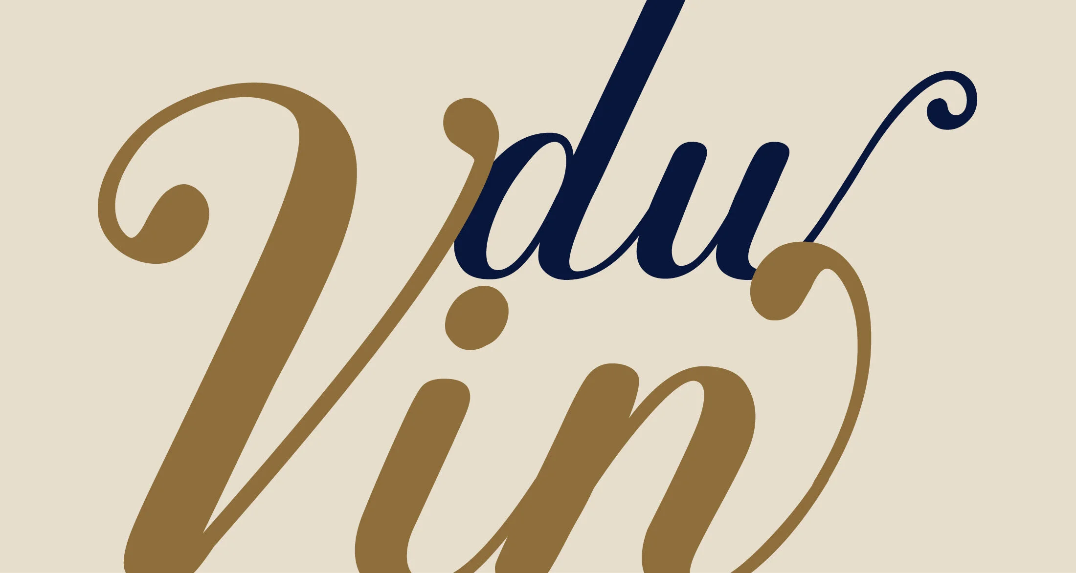


Vigna Typeface
I love creating unique lettered illustrations, but creating an entire set of letters that other people can use as well is especially exciting. Inspired by grape vines and wine bottle labels, this script font was borne out of a lettering project for a winery of just the single word, “vigna.” After creating the initial design, I designed the rest of the alphabet and fleshed out the entire font with alternates as well as swashes, reflective of the tendrils of the vines.
Services:
Custom Type Design


Mohemian Recruitment Campaign
Mohemian is not an agency; they build companies around the world and invest in ideas that make a sustainable impact. In order to attract new talent to join their team, I designed a campaign to help them show potential employees what they are about. In layering colorful analog handwritten type with their clean sans-serif type, I wanted to show how they tick - how they push outside the box and overtake traditional approaches. The big, colorful words are full of energy to represent their innovation and drive, while the smaller black text remains structured and more technical, showing both sides of a dynamic company. I produced postcards, posters, pens, and stickers for the campaign.
Services:
Hand Lettering
Print Production
Art Direction


